Last Update: 7 October 2022
Download RMarkdown: GRWG22_VectorData.Rmd
Overview
This tutorial covers how to manipulate geospatial vector datasets in R. A dataset with polygon geometries representing wildfire perimeters is joined with a dataset with point geometries representing air quality monitoring stations to determine which stations observed unhealthy concentrations of small particulate matter (PM2.5) in the atmosphere around the time of the Camp Fire in northern CA in 2018.
This tutorial assumes you are running this Rmarkdown file in RStudio Server. The
easiest way to do that is with Open OnDemand (OoD) on Ceres
or Atlas.
Select the following parameter values when requesting a RStudio Server
app to be launched depending on which cluster you choose. All other values can
be left to their defaults. Note: on Atlas, we are using the development partition
so that we have internet access to download files since the regular compute nodes
on the atlas partition do not have internet access.
Ceres:
Slurm Partition: shortR Version: 4.2.0Number of hours: 1Number of cores: 2
Atlas:
R Version: 4.1.0Partition Name: developmentQOS: normalNumber of hours: 1Number of tasks: 2
To download the Rmarkdown file for this tutorial to either cluster within OoD, you can use the following lines:
library(httr)
tutorial_name <- 'GRWG22_VectorData.Rmd'
GET(paste0('https://geospatial.101workbook.org/tutorials/',tutorial_name),
    write_disk(tutorial_name))
Language: R
Primary Libraries/Packages:
| Name | Description | Link |
|---|---|---|
sf |
Simple features for R | https://cran.r-project.org/web/packages/sf/index.html |
USAboundaries |
Historical and Contemporary Boundaries of the United States of America | https://cran.r-project.org/web/packages/USAboundaries/index.html |
ggplot2 |
Create Elegant Data Visualisations Using the Grammar of Graphics | https://cran.r-project.org/web/packages/ggplot2/index.html |
Nomenclature
- Vector data: Spatial data defined by simple geometry types (points, lines, and polygons) where each geometry feature can be assigned non-spatial attributes.
- CRS: Coordinate Reference System, also known as a spatial reference system. A system for defining geospatial coordinates.
- Spatial join: Combining two spatial datasets by the relationship between their geometries.
Data Details
- Data: National Interagency Fire Center’s Historic Perimeters dataset
- Link: https://data-nifc.opendata.arcgis.com/datasets/nifc::historic-perimeters-combined-2000-2018-geomac/explore
-
Other Details: The original dataset contains perimeters of wildfires in the US from 2000-2018 as a polygon feature collection. For this tutorial, the wildfire perimeters in CA during 2018 were extracted.
- Data: US EPA’s Air Quality System (AQS) database
- Link: https://aqs.epa.gov/aqsweb/documents/data_api.html
- Other Details: PM2.5 concentration data from this database covering CA in 2018 were retrieved and pre-processed for this tutorial.
Analysis Steps
- Fire perimeter data - read in and visualize the wildfire perimeter data
- Read in geojson file
- Visualize perimeters on map of CA
- Visualize non-spatial attributes
- Air quality data - read in the shapefile
- Buffer and spatial join - find the air quality stations within 200km of the fire perimeter
- Visualize - air quality impact around the Camp Fire
Step 0: Import Libraries/Packages
For this tutorial, we will use the sf package for handling vector data,
the USAboundaries for including state boundaries in our maps,
dplyr for general tabular data manipulations, ggplot2 for creating
visuals, and lubridate for handling dates. Each package except USAboundaries
is available from the site libraries accessible to RStudio Server on OoD for
both clusters. If you have not used USAboundaries before, you may install it
from CRAN with install.packages(USAboundaries) from within RStudio Server on OoD.
To learn more about installing packages on Ceres, see
this guide.
library(sf)               # Handling vector data
library(USAboundaries)    # Mapping administrative boundaries
library(dplyr)            # General data manipulation
library(ggplot2)          # Visualizations
library(lubridate)        # Date manipulation
Step 1: Read in fire perimeter data and visualize
The National Interagency Fire Center’s Historic Perimeters dataset has 23,776 polygons representing wildfire perimeters from 2000-2018. A version of the dataset filtered to wildfires in CA in 2018, since that is when the destructive Camp Fire occurred, will be used in this tutorial.
We will transform to planar coordinates for distance calculations. The 5070 EPSG
code is for the Equal Area CONUS Albers. If you kept the dataset in it’s
original CRS, WGS 84, sf would warn you about distance calculations not being
accurate.
fire_f <- 'Historic_Perimeters_Combined_2000-2018_GeoMAC_CA2018.geojson'
dnld_url <- 'https://geospatial.101workbook.org/ExampleGeoWorkflows/assets/'
httr::GET(paste0(dnld_url,fire_f),
          httr::write_disk(fire_f,
                           overwrite=TRUE))

fire_CA2018 <- st_read(fire_f) %>%
  st_transform(5070)
To get an idea of what the data look like, we can create a map.
# CA boundary
CA <- us_states() %>%
filter(state_abbr == 'CA') %>%
st_transform(st_crs(fire_CA2018))
# The Camp Fire feature
camp_fire <- fire_CA2018 %>%
filter(incidentname == 'CAMP')
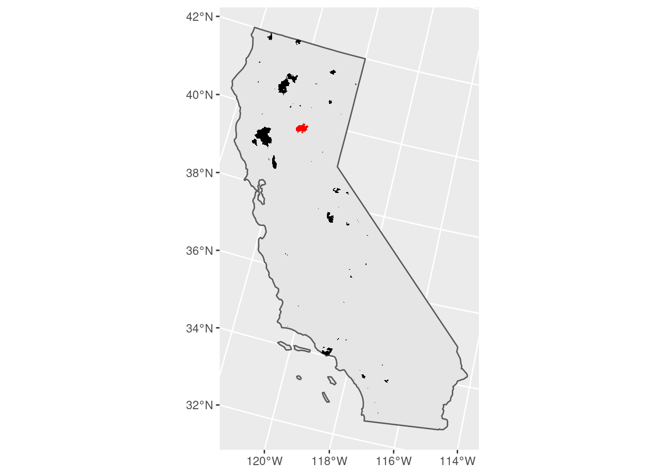
# Plot a map of all wildfires and
# highlight the Camp Fire.
fire_CA2018 %>%
ggplot() +
geom_sf(data = CA) +
geom_sf(fill = 'black',
color = NA) +
geom_sf(fill = 'red',
color = NA,
data = camp_fire)
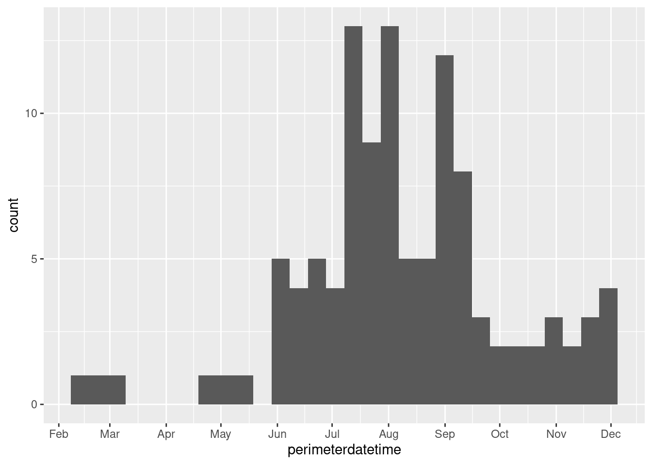
Since this feature collection has several attributes, we can also visualize, for example, when the fires occurred during the year. Note that the dates are when the fires’ perimeters are established, not when the fires start. Since fires can endure for many days and change their spatial extent over that time, this date is when the maximum extent of the fire was determined, which needs to be at the end of the fire.
# Plotting when wildfires occurred throughout 2018
fire_CA2018 %>%
  select(perimeterdatetime) %>%
  ggplot(aes(perimeterdatetime)) +
  geom_histogram() +
  scale_x_datetime(breaks = '1 month',
                   date_labels = '%b')
Step 2: Read in air quality data
We will read in an air quality dataset to showcase combining multiple vector datasets. The geometry type is point, representing sampling stations. This dataset can be downloaded with an API, but you need to register an account, so the download process has been done already and the data are available in our ‘session6’ folder. Some pre-processing for this dataset was done to make it into a feature collection.
aq_base <- 'air_quality_CA2018'
aq_zip <- paste0(aq_base,'.zip')
#dnld_url <- 'https://github.com/HeatherSavoy-USDA/geospatialworkbook/raw/master/ExampleGeoWorkflows/assets/'
httr::GET(paste0(dnld_url,aq_zip),
          httr::write_disk(aq_zip,
                           overwrite=TRUE))
unzip(aq_zip)

ca_PM25 <- st_read(paste0(aq_base,'.shp')) %>%
  st_transform(st_crs(fire_CA2018))
Step 3: Find the air quality stations within 200km of the fire perimeter
We will buffer the Camp Fire polygon and join that to the air quality data to find the nearby stations. Note that the direction of joining is important: the geometry of the left dataset, in this case the air quality points, will be retained and the attributes of intersecting features of the right dataset will be retained.
camp_zone <- st_buffer(camp_fire, 200000) # meters, buffer is in unit of CRS

air_fire <- st_join(ca_PM25, camp_zone)
Step 4: Visualize air quality around the Camp Fire
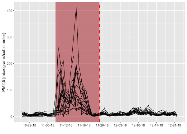
‘Around’ in this case should be in both space and time. We already found the air quality stations within 200 km from the fire perimeter. To make sure we are looking at the right time of year, we will relate the non-spatial attributes of the two feature collections. Both datasets come with date columns: when the air quality was recorded and when the perimeter was determined (so the latter is an approximate time near the end of the fire). We will filter our spatially- joined dataset to within 30 days of the fire perimeter date so we only consider air quality within a 2-month window around the time of the fire.
We can then plot the air quality metric of PM2.5 concentration (lower is better) as a function of time before/after the fire perimeter date. Each line is an individual air quality station. The figure indicates that there were several stations that recorded unhealthy to hazardous PM2.5 concentrations around the time of this wildfire.
# Filter to 30 days from fire perimeter date
air_near_fire <- air_fire %>%
  mutate(dat_lcl = ymd(dat_lcl), # local date for air quality measurement
         perimeterdate = as.Date(perimeterdatetime), # fire perimeter date
         date_shift = dat_lcl - perimeterdate,
         PM25 = as.numeric(arthmt_),
         station_id = paste(stat_cd, cnty_cd, st_nmbr)) %>%
  filter(abs(date_shift) <= 30)

# Define bounds of Camp Fire dates for illustrative purposes
# Camp Fire burned for 17 days- add a polygon to graph to visualize temporal overlap with low air quality
camp_dates <- ymd(c('2018-11-08','2018-11-25'))

# Camp Fire's maximum perimeter established at end of fire
fp_date <- unique(air_near_fire$perimeterdate)


air_near_fire %>%
  tidyr::complete(station_id, dat_lcl) %>%
  ggplot(aes(dat_lcl,PM25)) +
  annotate('rect', xmin = camp_dates[1], xmax = camp_dates[2],
            ymin = -Inf, ymax = Inf,
            fill = 'firebrick', alpha = 0.5) +
  geom_line(aes(group = station_id)) +
  geom_vline(xintercept = fp_date,
             color = 'red',
             lwd = 1,
             linetype = 'dashed') +
  scale_x_date(name = '',date_breaks = "1 week",date_labels = "%m-%d-%y") +
  scale_y_continuous(name = 'PM2.5 [micrograms/cubic meter]')
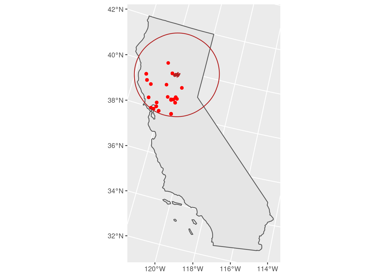
We can then map where those stations were - quite an extensive impact on air quality!
# 101 micrograms/cubic meter and higher is considered
# unhealthy for sensitive groups
unhealthy_air <- air_near_fire %>%
  filter(PM25 > 100)

unhealthy_air %>%
  ggplot() +
  geom_sf(data = CA) +
  geom_sf(color = 'red') +
  geom_sf(fill = 'firebrick',
          color = NA,
          data = camp_fire) +
  geom_sf(color = 'firebrick',
          fill = NA,
          data = camp_zone)